

My favourite documents to design are long, and text-heavy. I enjoy adding details that make the project easier to read and interesting to the very last page. My work on these documents includes overall layout, theme, illustrations, and stock photo selection.
Explore two report projects below, A Tale of Two Cities and an Agri-Business Report.

CLIENT
Calgary Chamber of Commerce
via Print Three
via Print Three
project: A Tale of Four Cities
Design a 28-page magazine style report using
Calgary Chamber's extensive brand guidelines.
Calgary Chamber's extensive brand guidelines.

Overall design
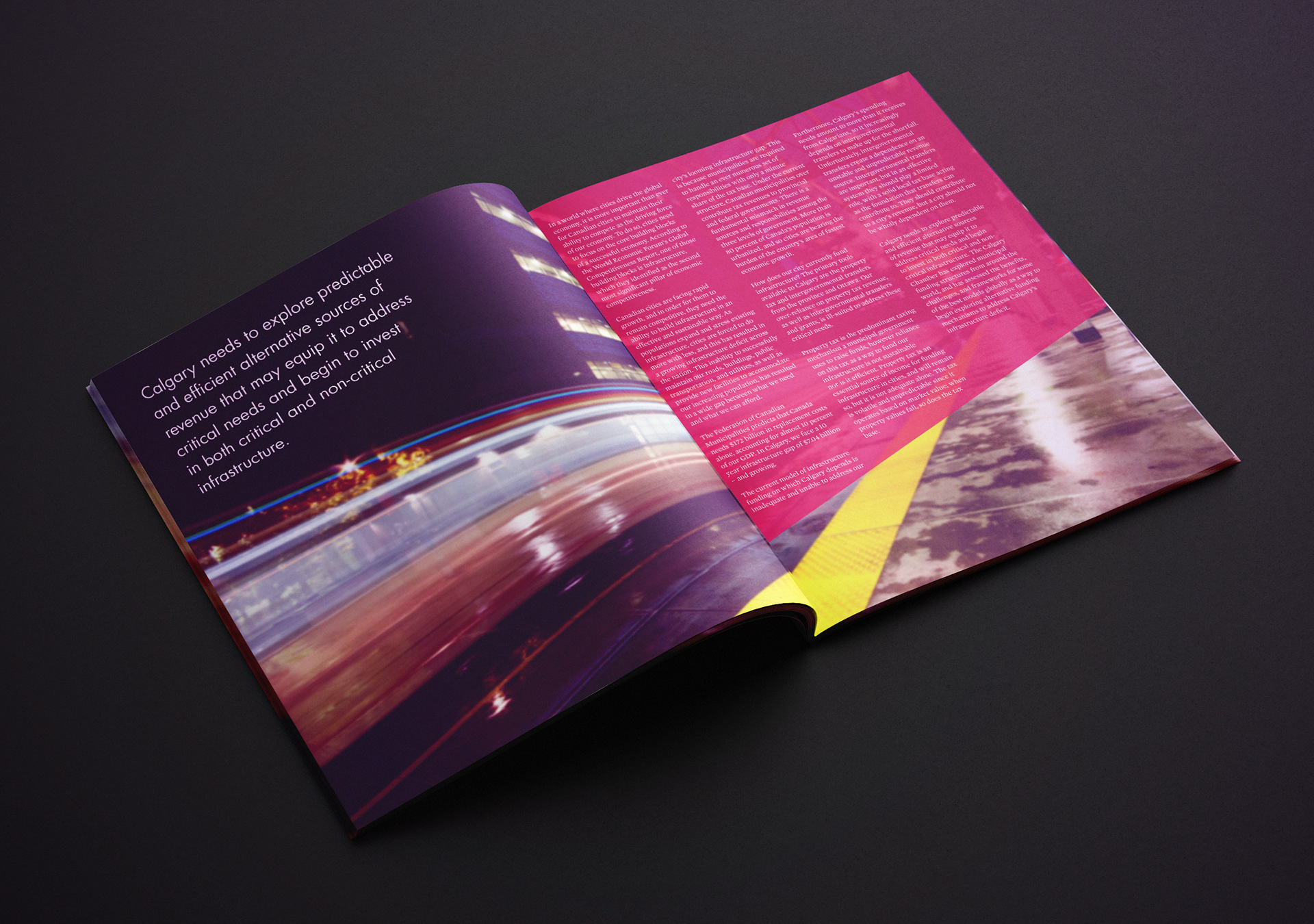
The blurred abstract visuals of a bustling downtown cityscape gives the overall vibe of the report:
vibrant, energetic, and bold.
vibrant, energetic, and bold.
Note the pink block's shape, the bottom angle is specified in the brand guidelines and is used on most designs. This visual building block is a way I tie each page together and contain pop out text boxes.
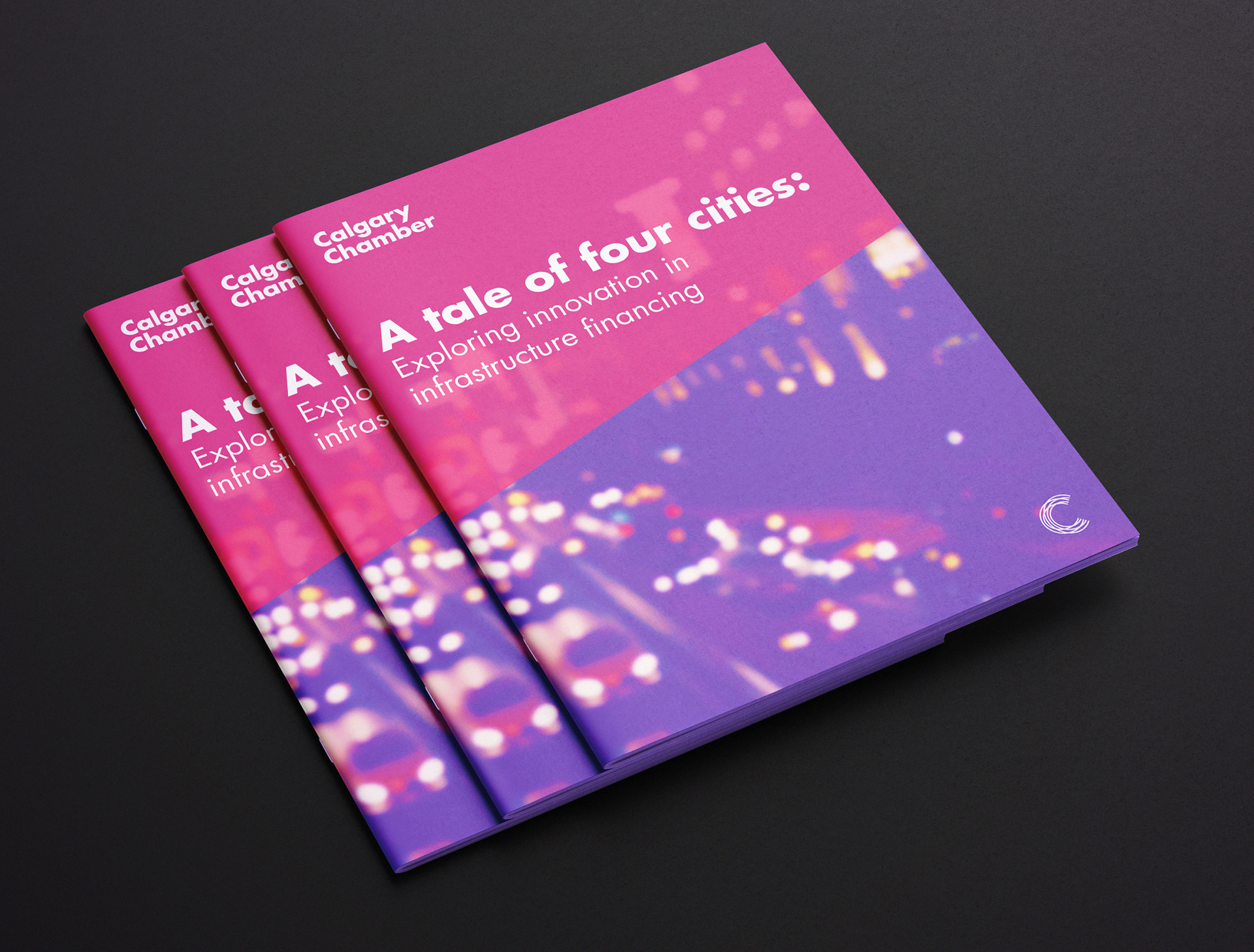
Report cover page, featuring a bustling city.
A fast moving C-Train image for initial impact and establishing theme.
City Sections
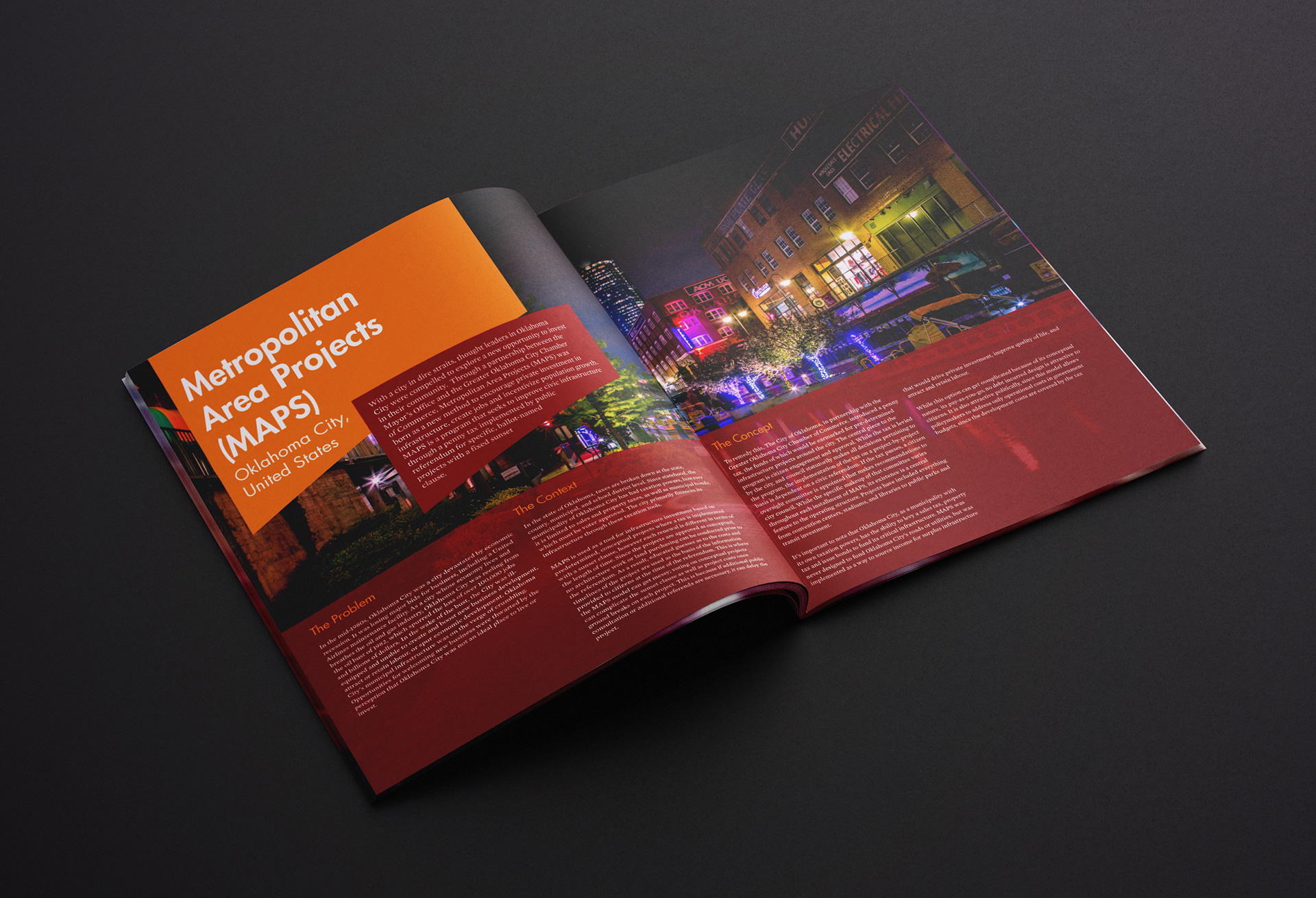
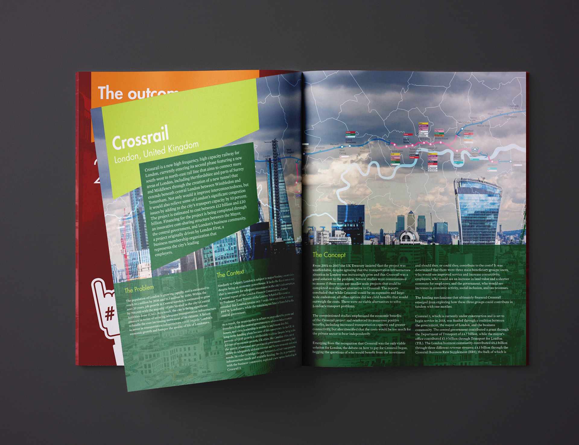
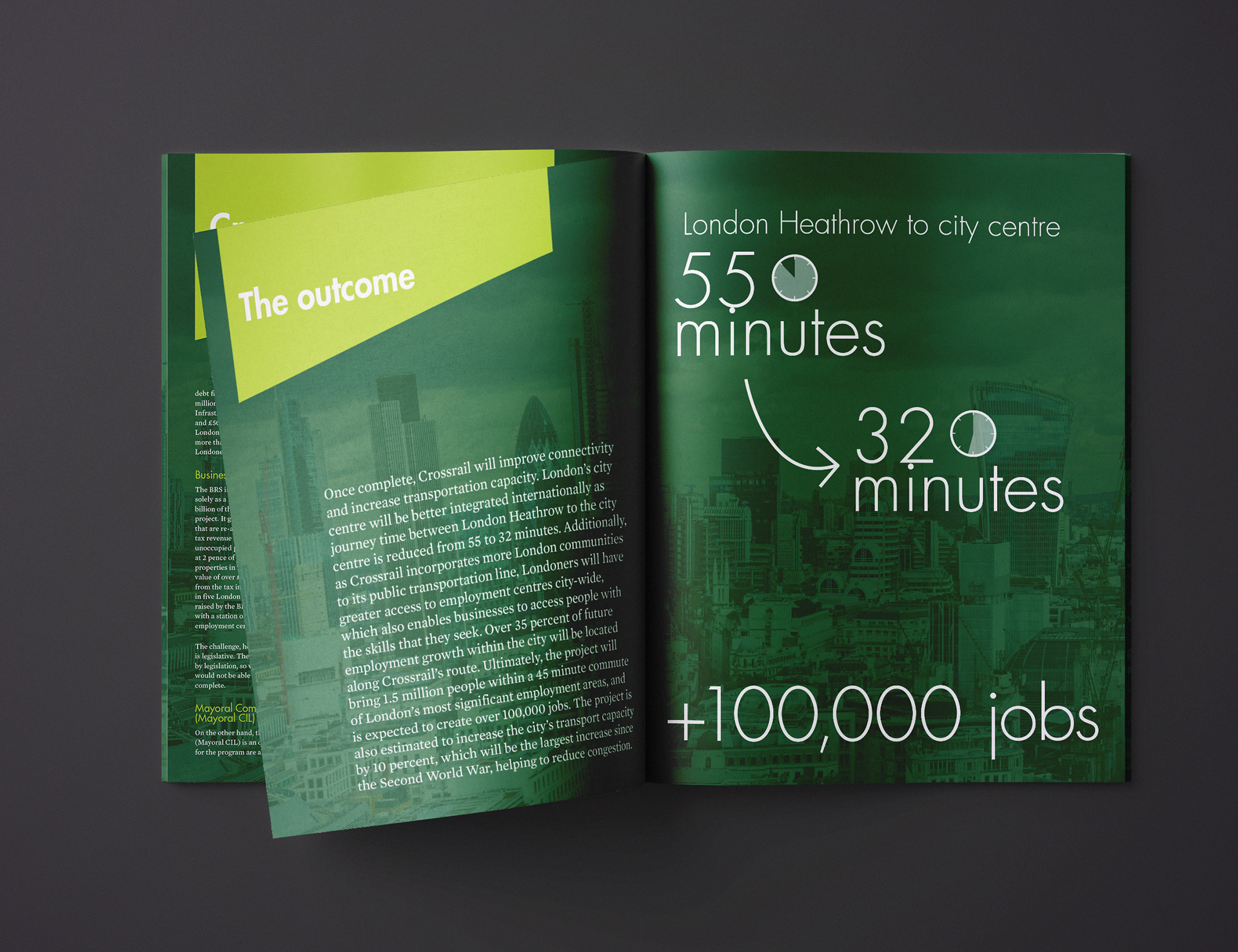
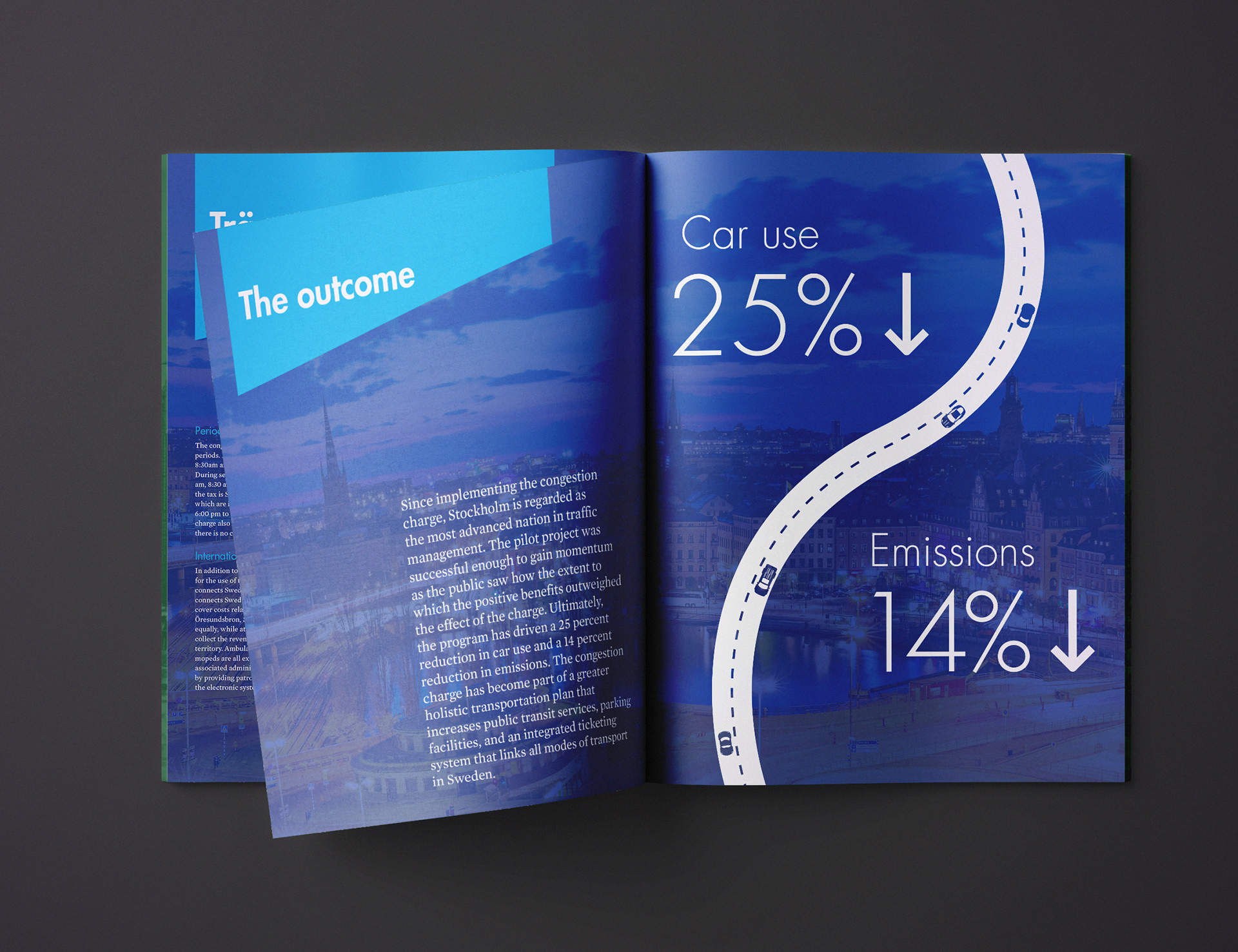
Each city was given a colour story from within the brand guidelines. I chose photos from each city to convey innovation and forward thinking.
Each city's section has a conclusion with simple graphics to draw attention to the main points of the article.
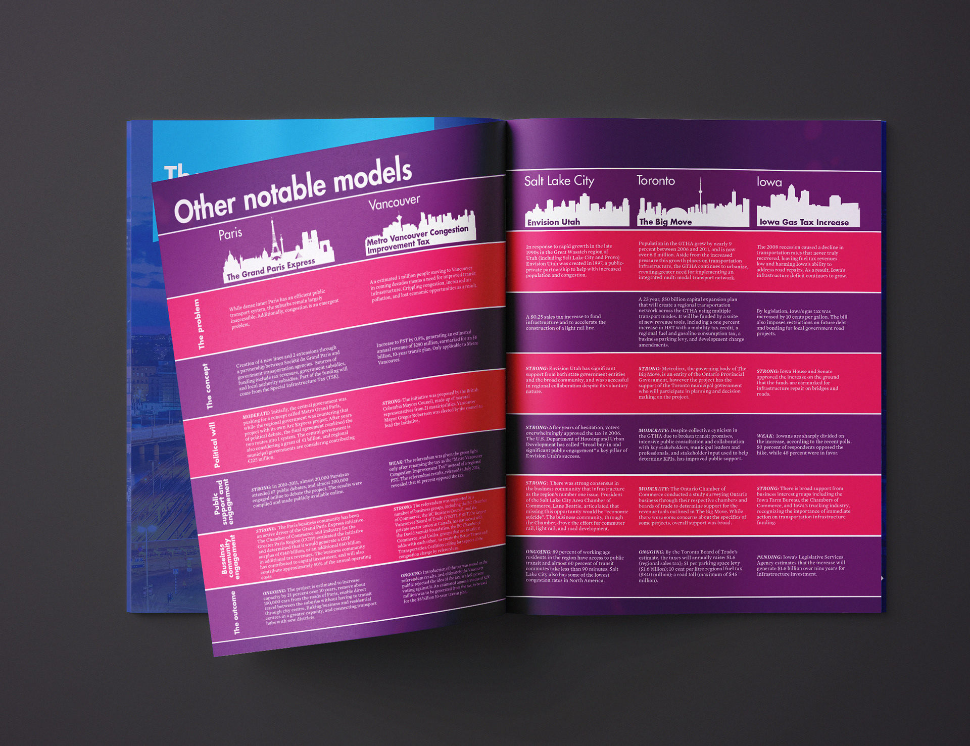
Information Table & Conclusion
I created a streamlined table to display information on other notable models for transportation funding models. Aligning information in horizontal lines allows for quick reference and direct comparison between cities.
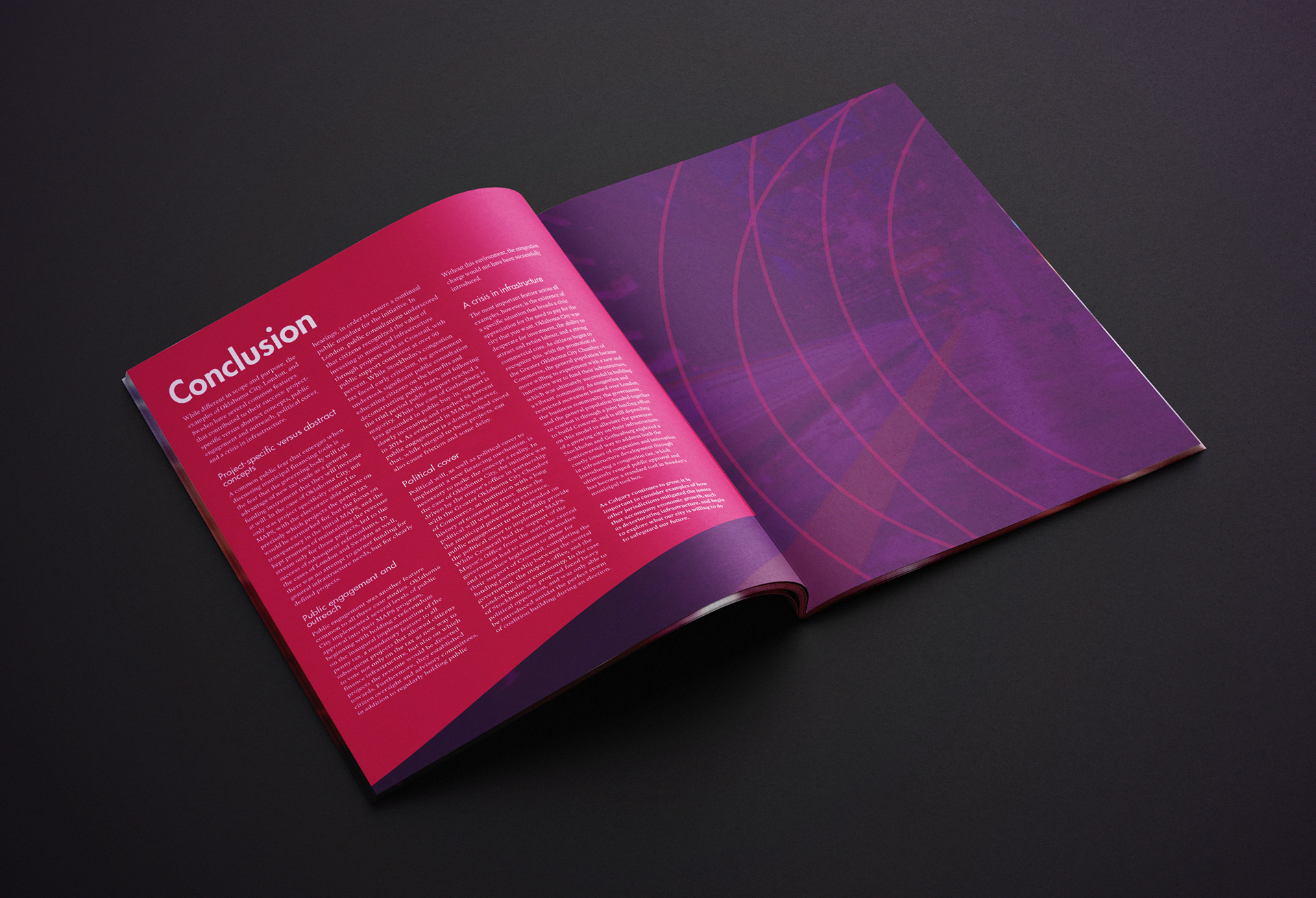
The conclusion mirrors the inside front page, with toned down imagery to create breathing room for reading the important take-away points.

CLIENT
Calgary Chamber of Commerce
via Print Three
via Print Three
project: Agri-business report
Design a friendly looking report highlighting data
using the brand guidelines.
using the brand guidelines.

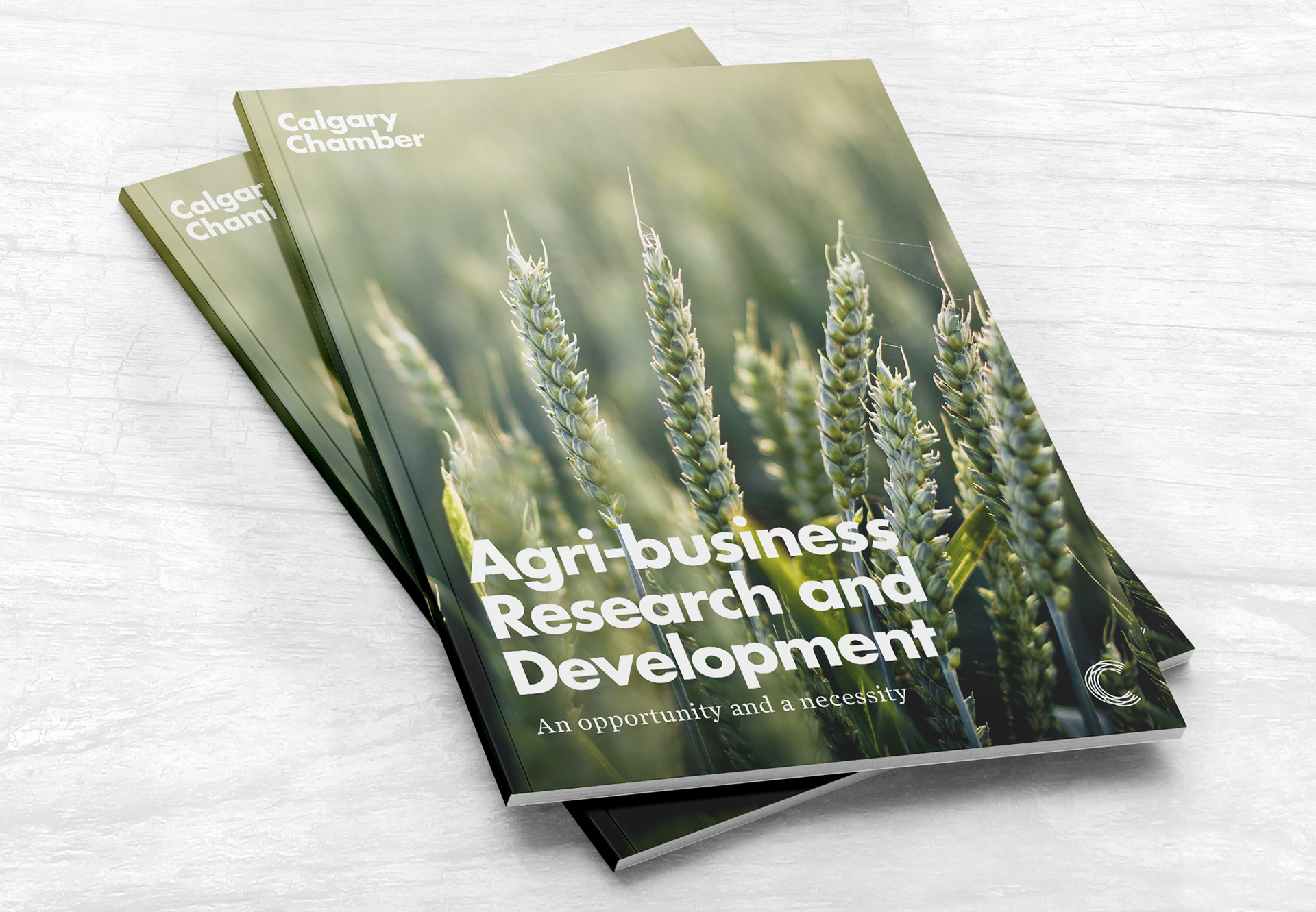
Cover
This type of report needs to be no-nonsense but still approachable and hold someone's interest. I used bold white text on a pretty wheat photo for instant theme recognition.
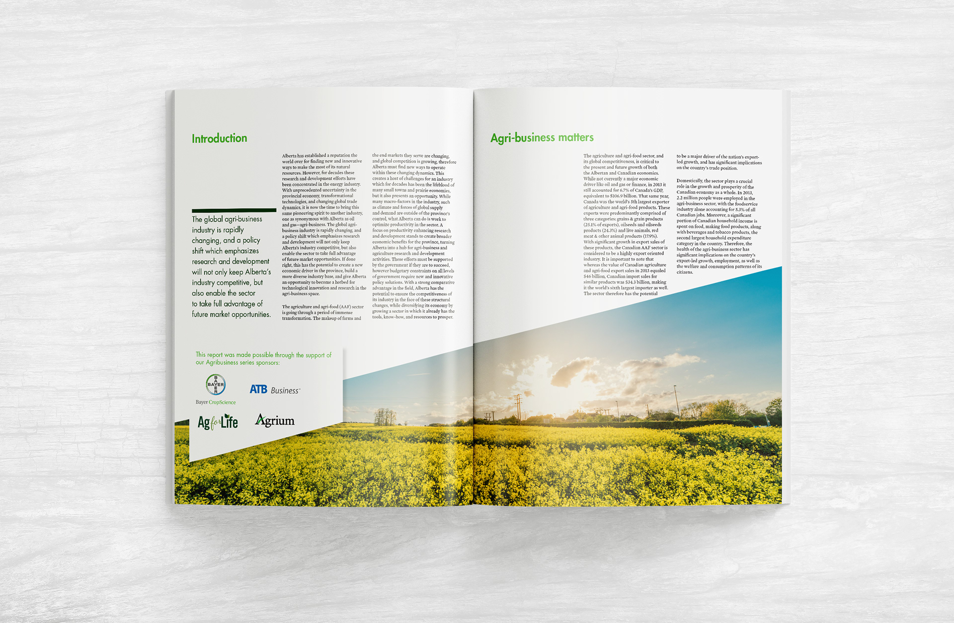
Overall Design
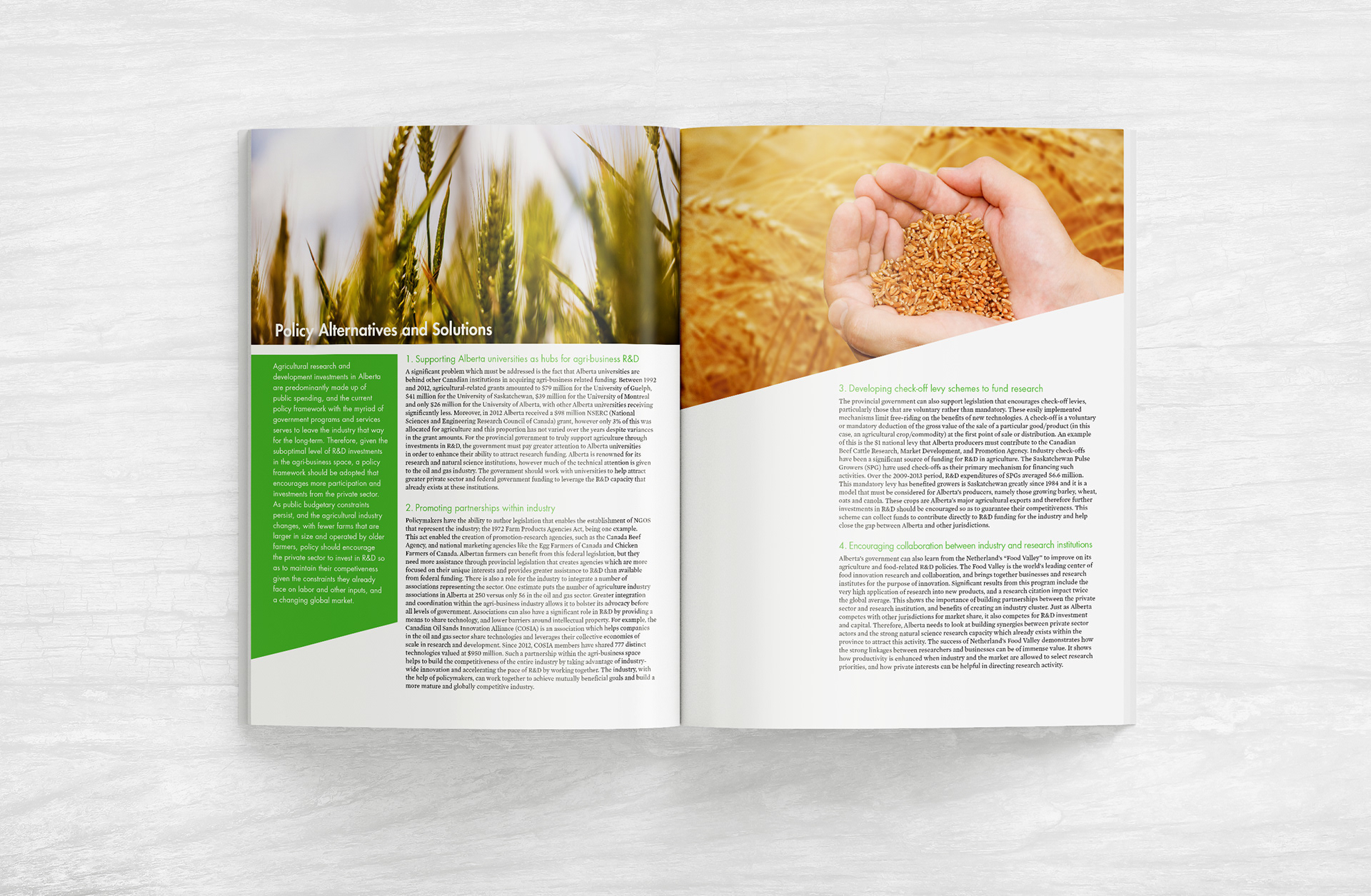
I chose a friendly Alberta farm theme, with cheerful imagery and bright colours. A white background and black text allows maximum print readability for the long blocks of text.
The signature shape creates the structure for this design, along with a simple three column grid.
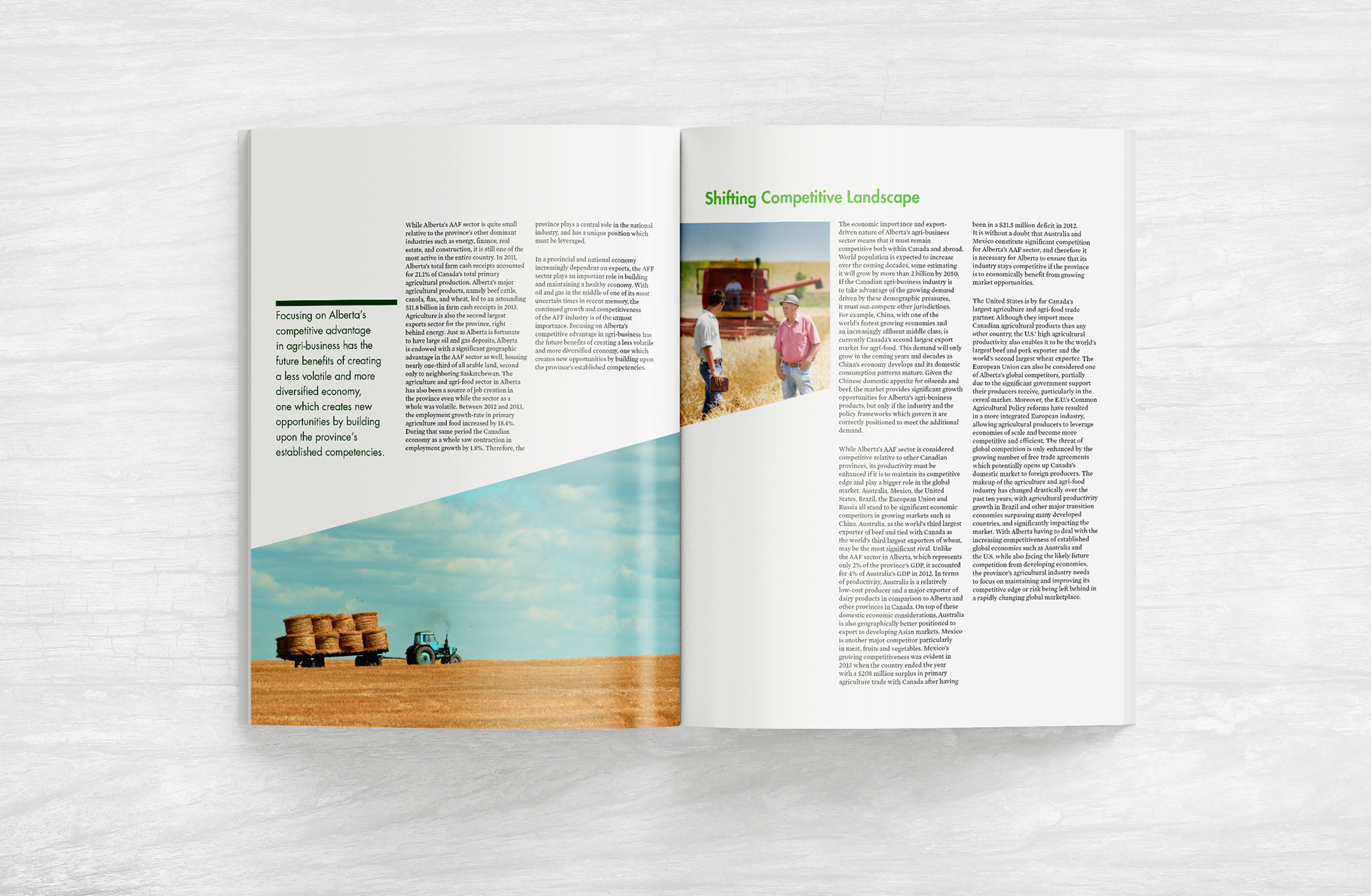
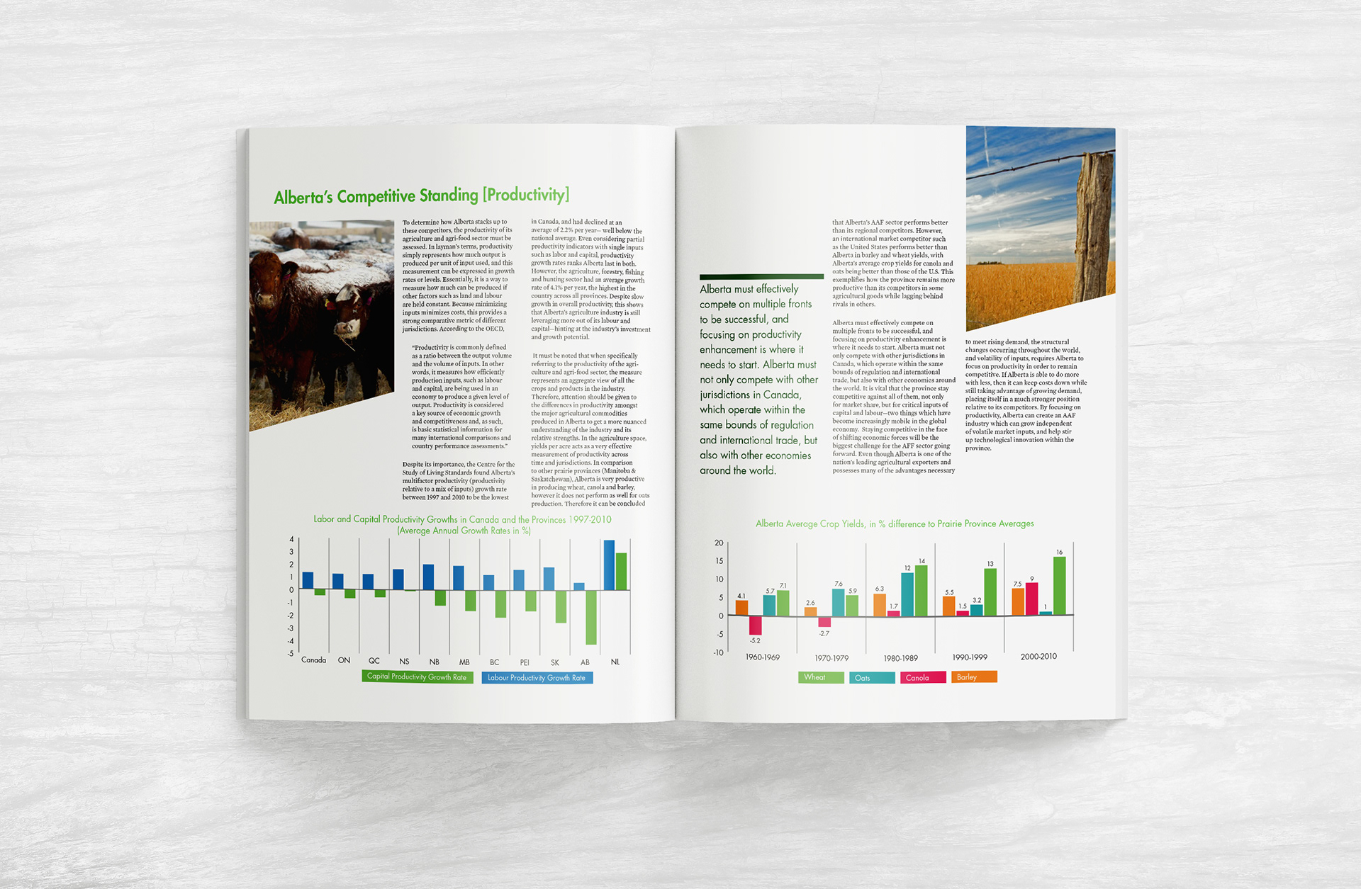
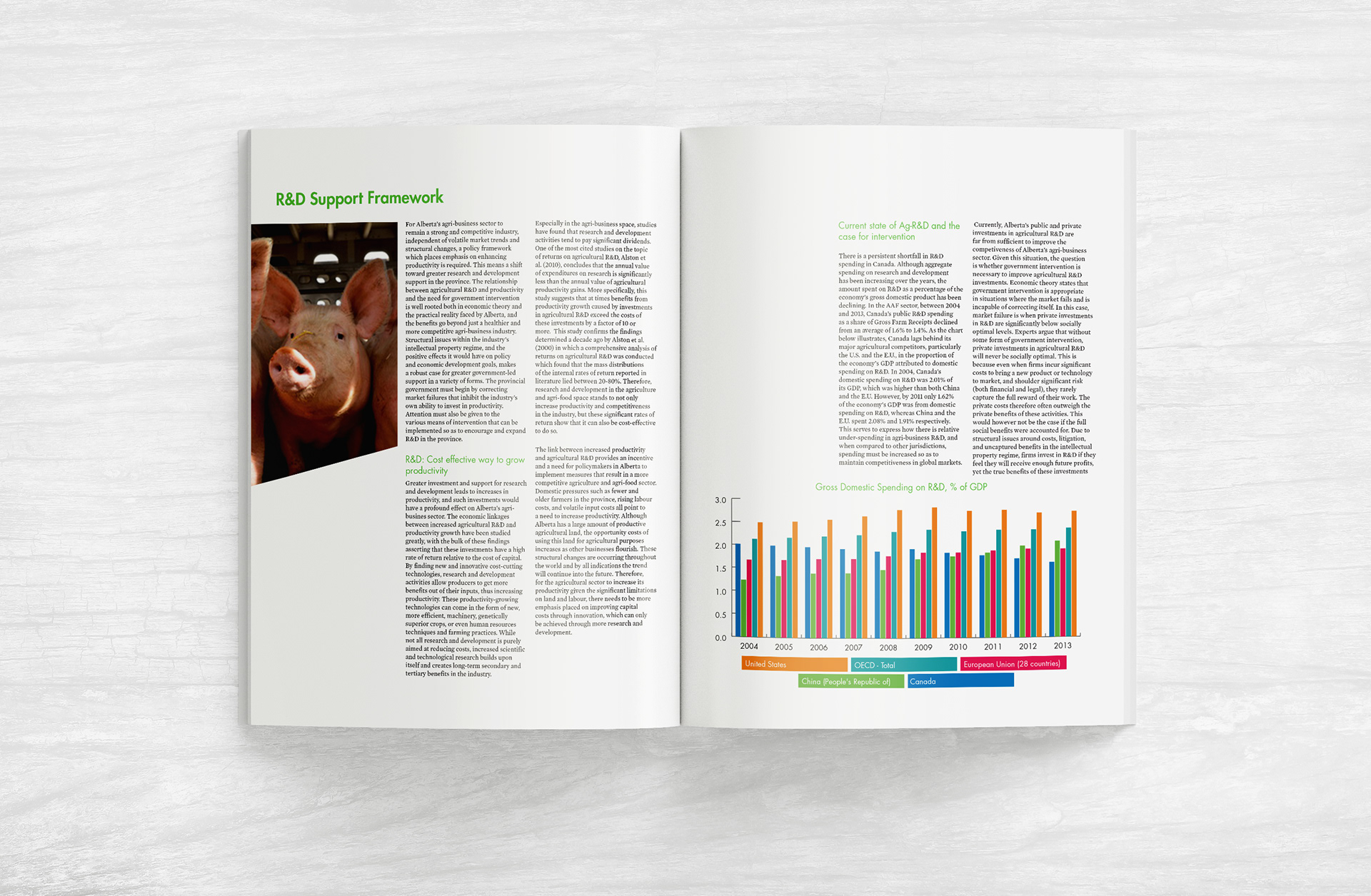
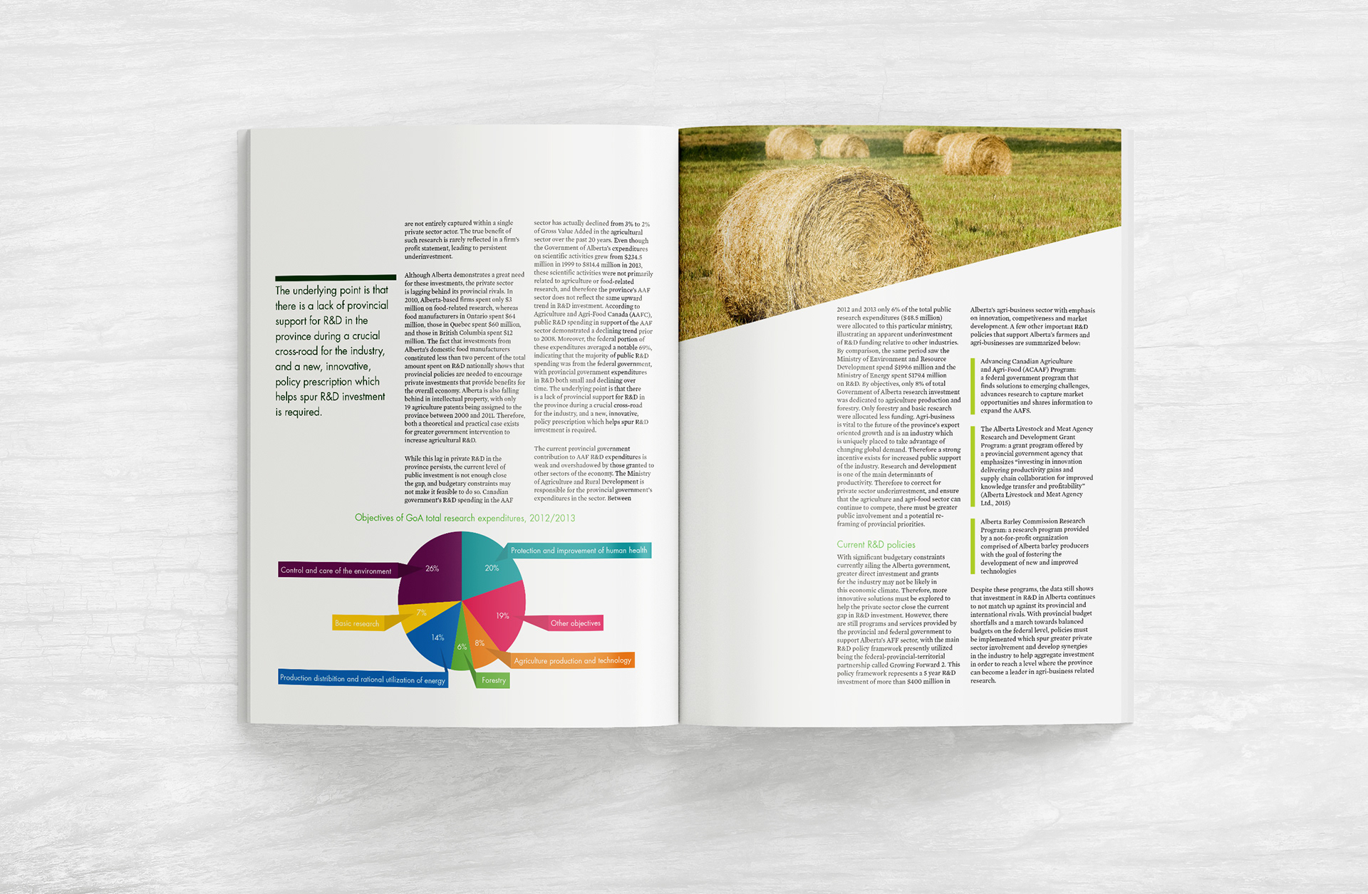
Information Heavy Pages
Spreading graphs over multiple pages helps keep text blocks shorter and the white space balanced. Simplifying graphs and using clear legends allows for quick data interpretation. Pleasant farm imagery and pops of bright colours keep the theme light.