

Guide Books
Information is power! I love to create guides that are easy to follow and understand. Little graphics throughout keeps documents from looking too generic and gives a professional touch. Creating diagrams or illustrations that can be plucked out and used in many other documents or infographics gives these guide books versatility.
Explore two projects below, a tree planting guide and an election platform.

Client
The Calgary Climate Hub
Volunteer Work
Volunteer Work
Project
Turn a text document into a guide book for Calgarians to encourage
tree equity and increasing the tree canopy.
tree equity and increasing the tree canopy.

OVERALL CONCEPT
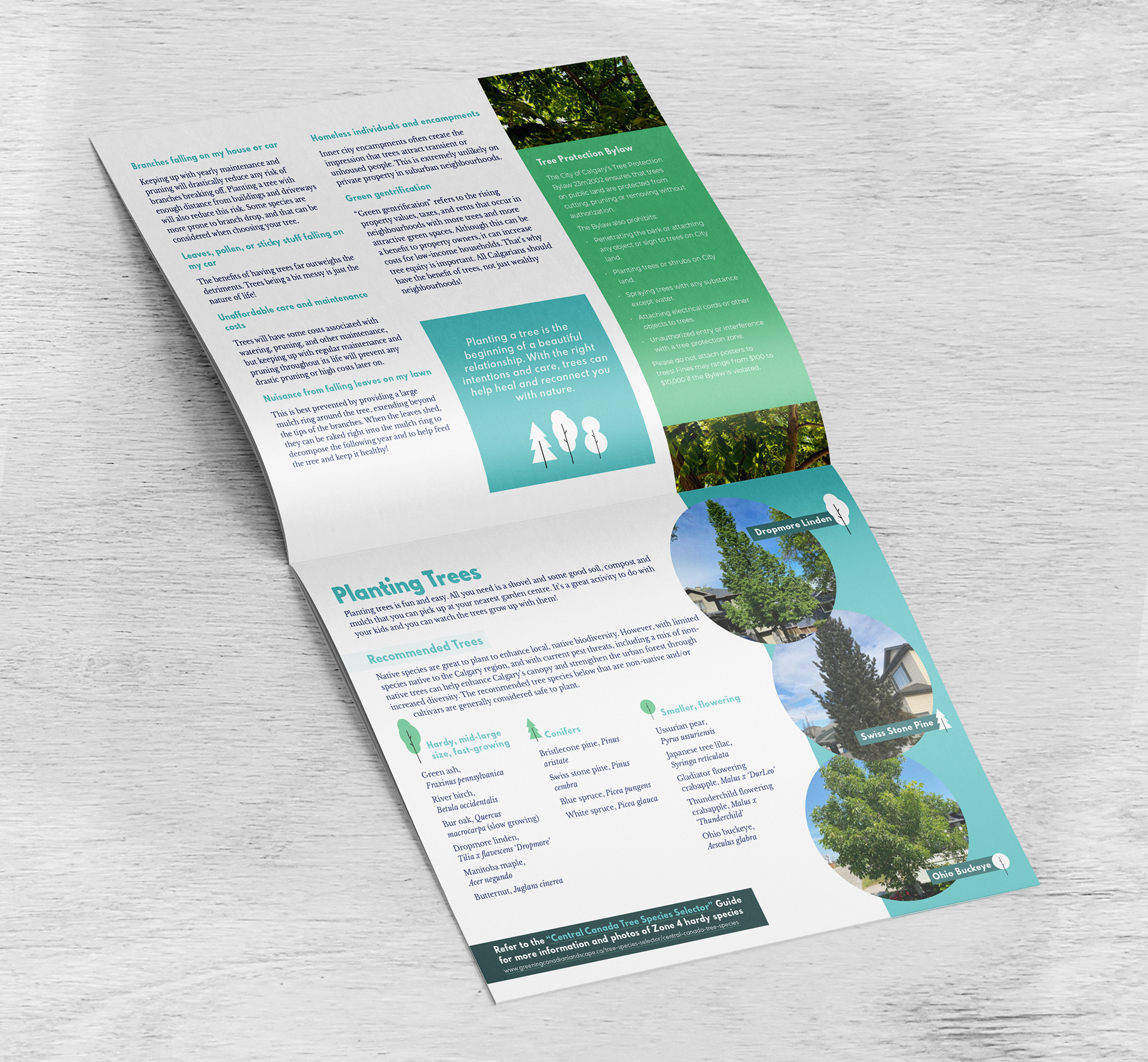
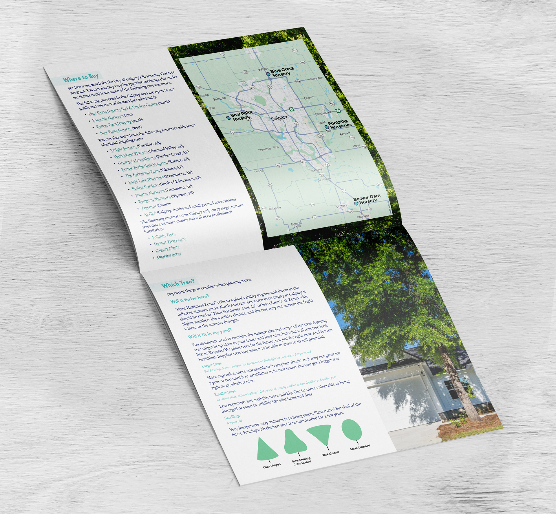
I wanted this guide to be friendly. The end goal of the Calgary Climate Hub's Tree Equity Group is to translate this document into other languages. To make redesigning in other languages easy, the layout is simple and flexible. I relied on a strong colour story and simple tree motifs to keep the design cohesive.
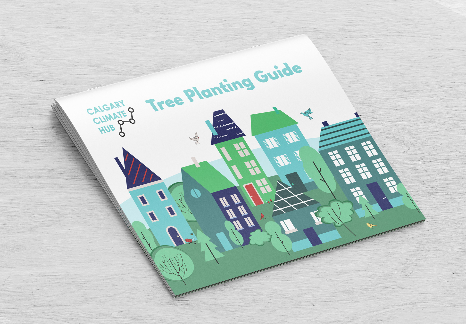
Cover
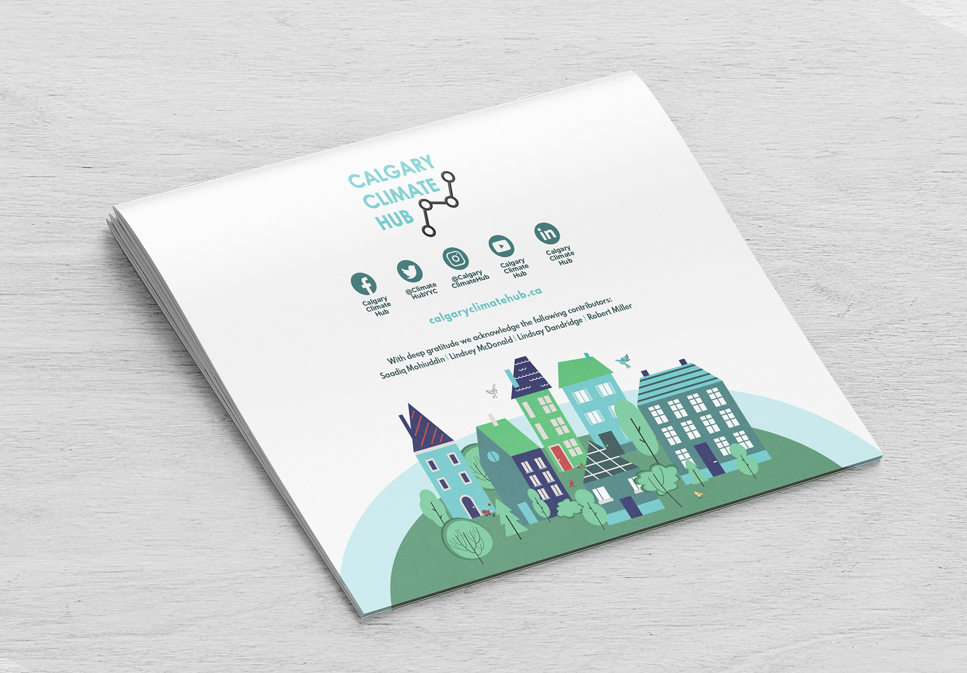
I created this happy treed urban neighbourhood, outfitted in brand colours, from a few stock illustrations. Multiple dwelling types are included to show diversity and inclusion, implying that planting trees in your yard is for everybody.
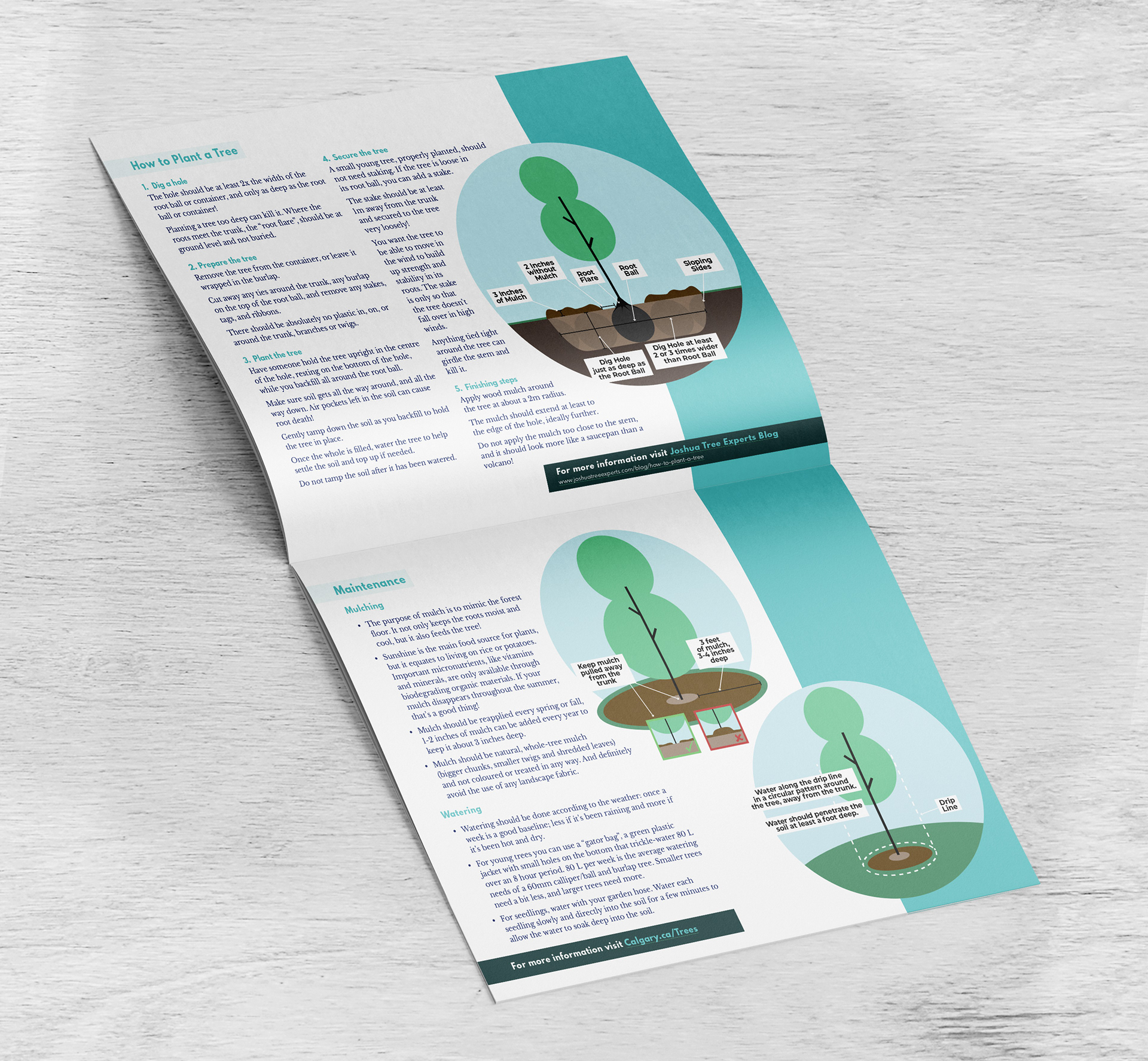
Diagrams
I drew planting diagrams to reiterate the information in the text with as few words as possible. The intention is to reuse these graphics for other presentations the group gives about planting trees.
Graphics
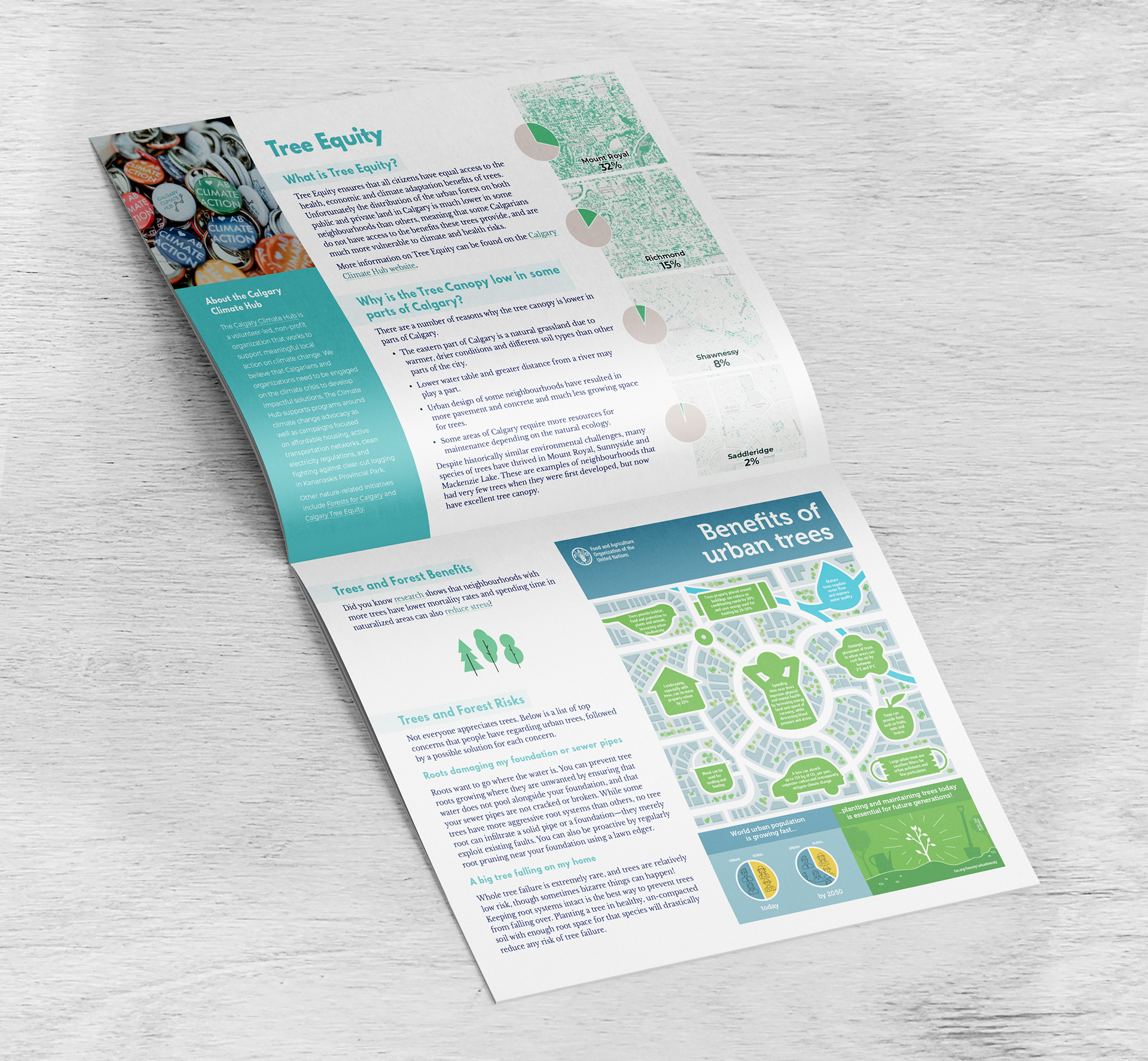
To clearly relate percentages to the maps of tree cover, I added colour coordinated pie charts. I used an existing infographic from the United Nations to illustrate the benefits of urban trees. I sourced photos from members of the writing team, and found Calgary specific stock photos to fill in gaps.

Client
The Calgary Climate Hub
Volunteer Work
Volunteer Work
Project
Turn a text document into an infographic style document to
reach Calgarians before a provincial election.
reach Calgarians before a provincial election.

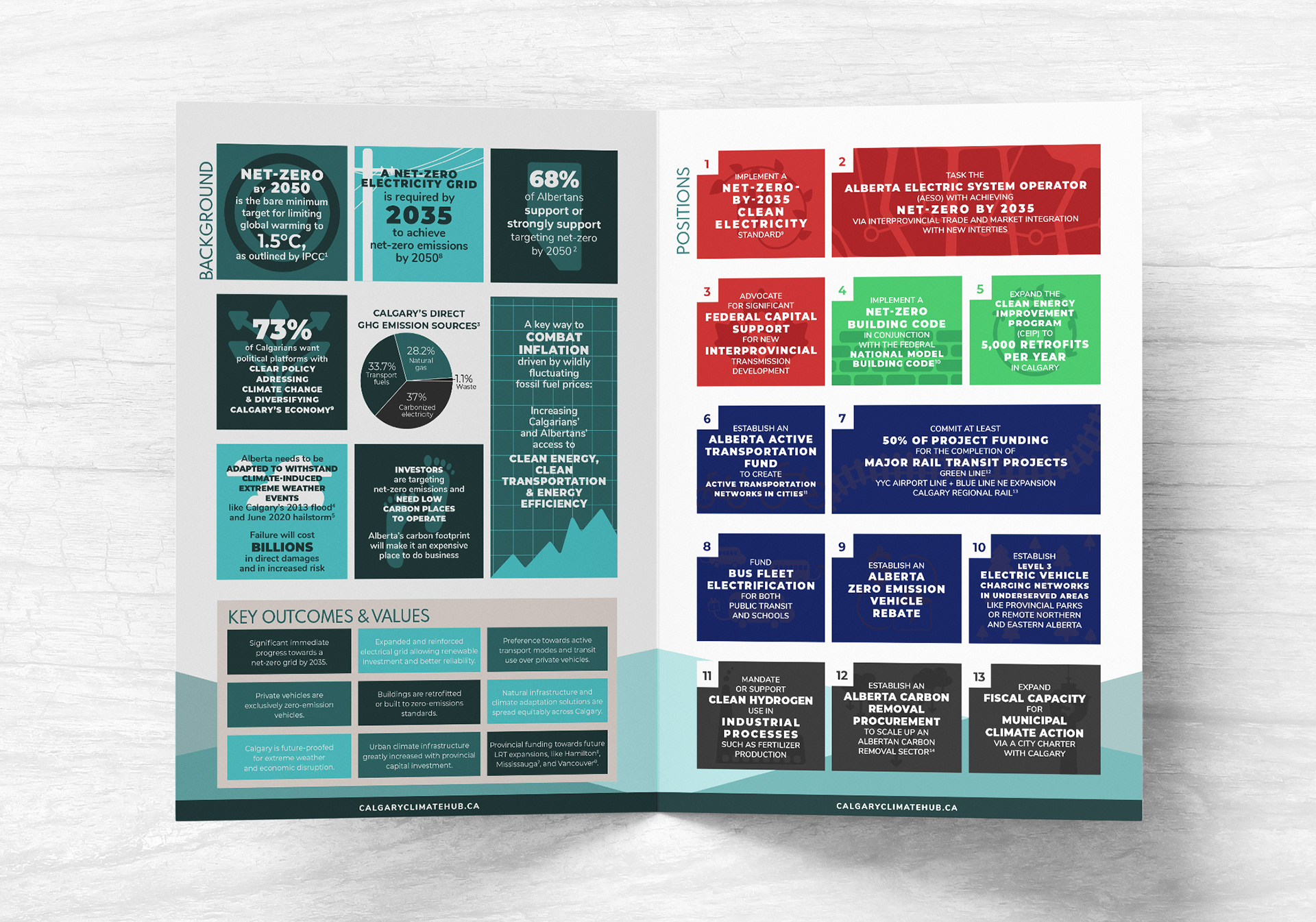
concept
A platform has many building blocks, my concept was to turn the positions into blocks that fit together. Each position has it's own box, and each category has it's own colour. I wanted to use big numbers and small icons to drive points home quickly.
Inside Spread and Back Cover
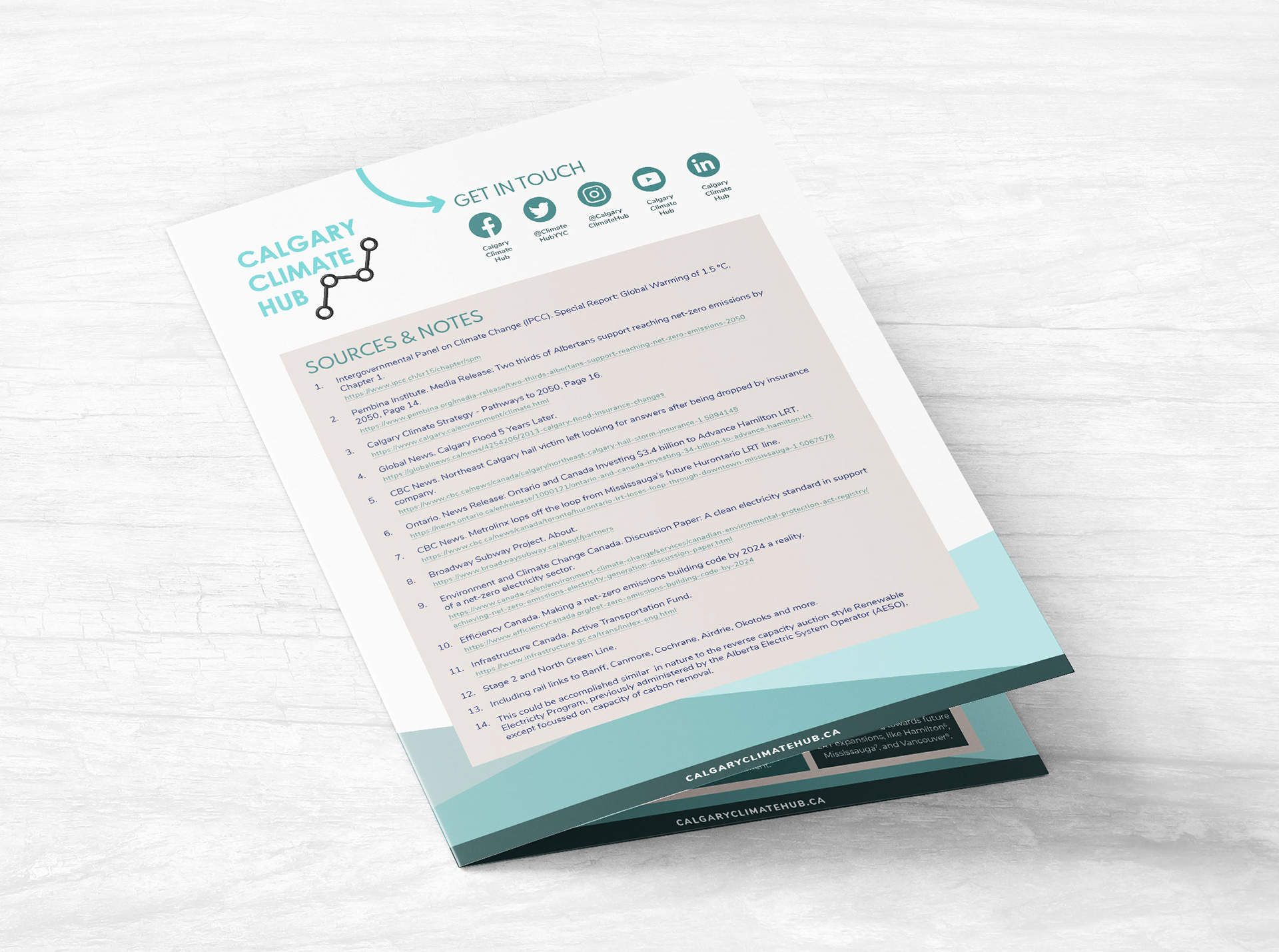
Background information on the left hand page was organized into tidy blocks of the Calgary Climate Hub's primary brand colours. On the right hand page, the positions were given the brand's secondary colours. I doodled illustrations for the background of each box. These graphics can be pulled out and used as icons in future documents. The back cover has clearly organized sources to ensure information feels trustworthy.
Instagram Posts
Each category was divided into a separate Instagram carousel post. I chose stock photos to complement each topic to entice people to swipe for more. Posted in order, the carousels went out one per week in the month leading to the election.